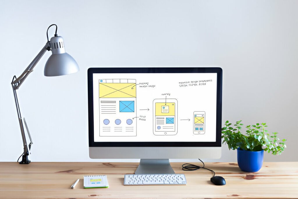
Have you ever struggled to make your website look great on all devices? You’re not alone. Luckily, container queries are here to revolutionize how we design responsive websites. Let’s dive into what container queries are, why they matter, and how you can use them right now.
What Are Container Queries?
Think of container queries as the key to unlocking perfect web design. Unlike traditional media queries that respond to the viewport size, container queries respond to the size of a container element. This means your content can adapt more precisely to different layouts.
Why Container Queries Are Important
Making Websites Truly Responsive
Why should you care about container queries? Because they make your website truly responsive. Whether your content is in a sidebar, a main section, or a tiny widget, container queries ensure it looks great everywhere.
Enhanced User Experience
Happy users are returning users. By using container queries, you can enhance the user experience by web.dev providing a seamless and visually appealing website on any device.

Basic Concepts of Container Queries
The Anatomy of a Container Query
Before diving in, let’s understand the basic structure. A container query consists of:
- A container: The element you want to respond to.
- Query parameters: Conditions based on the container’s size.
Syntax and Structure
The syntax might seem intimidating at first, but it’s pretty straightforward. Here’s a simple example:
cssCopy code@container (min-width: 300px) {
  .element {
    background-color: lightblue;
  }
}
How to Implement Container Queries
Setting Up Your Environment
Before using ensure your development environment is up to date. Most modern browsers support container queries, but always double-check for compatibility.
Writing Your First Container Query
Start simple. Identify a container, set the query parameters, and define the styles. Here’s a step-by-step guide:
- Choose the container: Select the element you want to apply the query to.
- Set query parameters: Define the conditions (e.g., min-width, max-width).
- Apply styles: Specify the styles that should apply when conditions are met.
Step-by-Step Guide to Using Container Queries
Step 1: Identify the Container
Find the HTML element you want to target. This could be a div, section, or any other container.
Step 2: Define Query Parameters
Decide the conditions based on the container’s size. For instance, if you want to change styles when the container is at least 500px wide, you’d set min-width: 500px.
Step 3: Apply Styles
Write the CSS rules that should apply when the conditions are met. For example:
cssCopy code@container (min-width: 500px) {
  .container-element {
    font-size: 1.2em;
  }
}
Examples of Action
Real-World Scenarios
Imagine you have a sidebar that sometimes moves to the bottom on smaller screens. With you can style it differently based on its width, not the entire screen’s width.
Sample Code
Here’s an example for better understanding:
cssCopy code/* Define the container */
.sidebar {
  container-type: inline-size;
}

/* Apply styles based on the container's size */
@container (min-width: 400px) {
  .sidebar {
    background-color: lightgreen;
  }
}
Best Practices
Keep It Simple
Start with simple queries and gradually add complexity. Avoid overcomplicating your CSS with too many
Test Across Devices
Always test your website on multiple devices to ensure it looks great everywhere. Emulators and responsive design tools can be incredibly helpful.
Common Pitfalls and How to Avoid Them
Overusing
Don’t go overboard. Too many can make your CSS difficult to maintain. Use them judiciously.
Browser Compatibility
Ensure your work across all major browsers. Keep an eye on browser updates for improved support.
How Improve SEO
Enhanced User Experience
A better user experience means visitors stay longer on your site, reducing bounce rates and improving SEO.
Faster Load Times
By optimizing styles based on container size, you can ensure faster load times, which is a critical factor for SEO.
Future of Web Design
More Dynamic Layouts
As become more prevalent, expect more dynamic and adaptable web layouts, making websites even more user-friendly.
Continuous Evolution
Web design is always evolving. This are just the beginning of more sophisticated and responsive design techniques.
This are a game-changer for web design. By focusing on the size of individual elements rather than the entire viewport, they offer more precise and flexible design options. Start experimenting with today and see how they can transform your website’s responsiveness and user experience.
